Your Learning Journey, Quantified
Leverage real-time emotional analytics to capture audience sentiment and feedback for every specific moment the presentation.
Leverage real-time emotional analytics to capture audience sentiment and feedback for every specific moment the presentation.
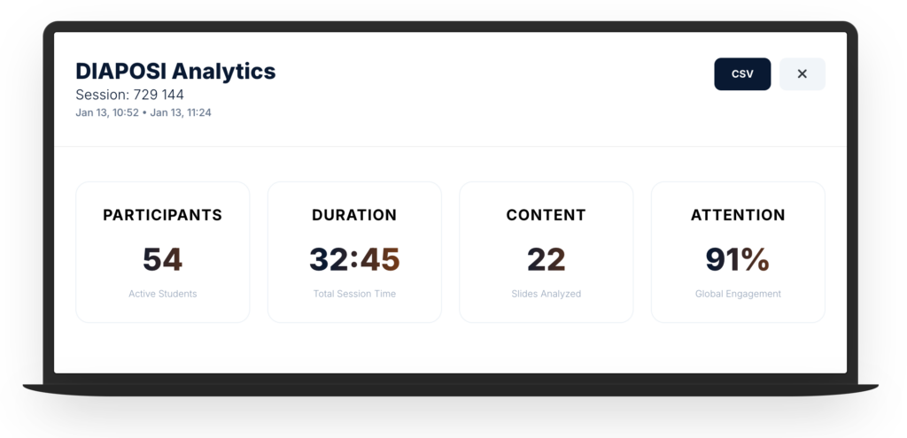
DIAPOSI Analytics
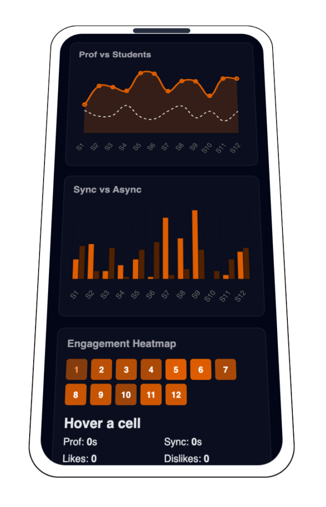
Prof time vs Students per slide
This graph provides a dual-layered timeline of your session. The Navy Line represents your actual speaking pace on each slide, while the Student Engagement tracks the cumulative time your audience spent viewing that specific content.
Sync vs Async Average Seconds
This bar chart provides a side-by-side comparison of student behavior for every slide in the presentation. Avg Sync represents the average time students spent looking at the slide while the teacher were actually presenting it. Avg Async represents the time students spent on that slide looping back to review it after you moved on.
Engagement Heatmap
the session’s "thermal signature," providing an instant, high-level map of audience energy across your entire presentation. By translating complex attention metrics into a color-coded gradient
--
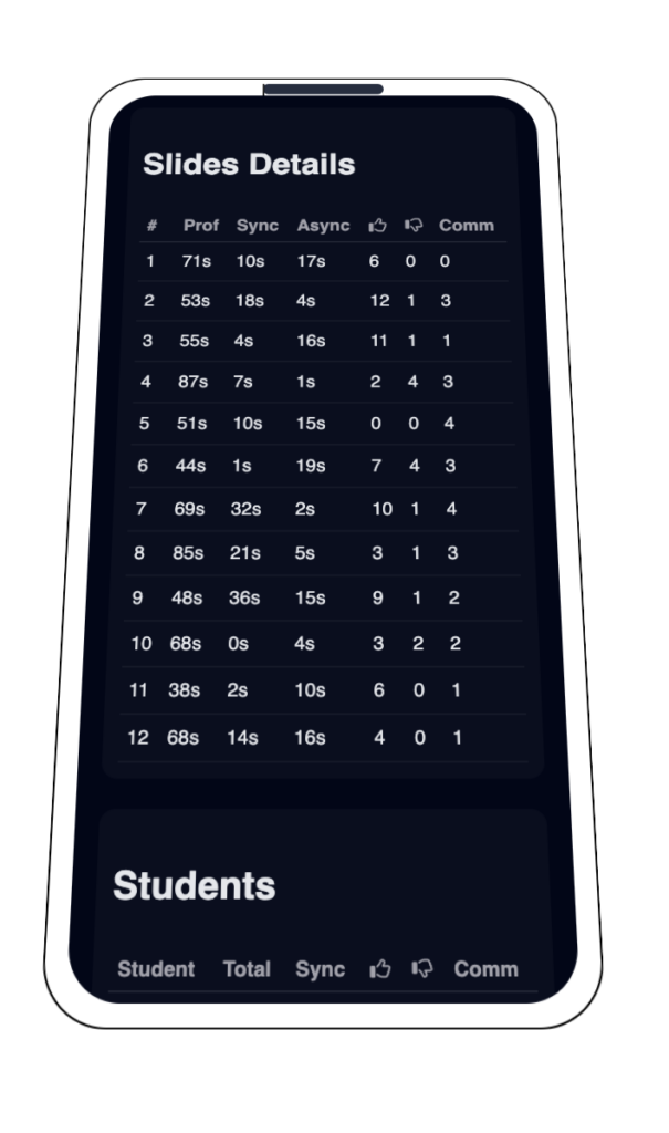
With all the data gathered in the session, these two comprehensive tables that serve as the ultimate "Audit Log" for the performance. The Slides Performance Table acts as a content diagnostic, allowing us to conclude which specific slides captured the most human-seconds of attention and where the "Sync Gap" occurred between your speech and their focus. Simultaneously, the Student Activity Table allows us to conclude the individual engagement levels of the audience, transforming anonymous student into clear behavioral profiles that distinguish between students who followed your lead and those who explored independently
With all the data gathered in the session, these two comprehensive tables that serve as the ultimate “Audit Log” for the performance. The Slides Performance Table acts as a content diagnostic, allowing us to conclude which specific slides captured the most human-seconds of attention and where the “Sync Gap” occurred between your speech and their focus. Simultaneously, the Student Activity Table allows us to conclude the individual engagement levels of the audience, transforming anonymous student into clear behavioral profiles that distinguish between students who followed your lead and those who explored independently
Slides Performance
0 Slides| # | Prof Time | Avg Sync | Avg Async | Total Time | Comments | Feedback |
|---|
Student Activity
0 Active| Student | Sync Time | Async Time | Total Session | Engagement | Comments |
|---|
Session Finalized
Your 360° performance audit and engagement metrics are now ready for review From both student and teacher

FAQ About Analytics
What is the difference between "Sync" and "Async" engagement?
Sync (Synchronous) refers to students who are viewing the same slide as the professor in real-time. Async (Asynchronous) refers to students who have navigated away from the professor’s current slide to review previous content or peek at upcoming slides during the live session.
How is the "Attention" metric calculated?
Global Attention (e.g., 91%) is a weighted average based on how many students had the session tab active and in the foreground compared to the total session duration. A drop in this percentage usually correlates with students switching to other browser tabs or apps.
Why does some slide data show a spike in "Async Discovery"?
A spike in Async Discovery typically indicates that a specific slide was complex or highly informative, causing students to return to it later in the session to take notes or clarify a point while the professor moved on to other topics.
What do the different colors in the Heatmap represent?
The heatmap uses color intensity to visualize student density. Navy (Primary) represents standard engagement, while Orange (Accent) indicates “Hot Spots”—slides where students spent significantly more time, clicked more frequently, or submitted the most feedback/likes.
Can I identify which specific students are struggling?
Yes. By exporting the CSV Report, you can view a per-token breakdown of engagement. Students with high “Async” time but low “Sync” time may be having trouble keeping up with the lecture pace and might require additional support.
What does "Prof Presence vs. Student Time" tell me?
This comparison helps you measure the “after-life” of a slide. If Prof Presence is low (you spent 30s on a slide) but Student Time is high (the class spent 500s total), it means the slide’s content was powerful enough to trigger significant independent study or discussion.